


A good understanding of data is one of the key essentials to designing effective Machine Learning (ML) algorithms. Realizing the structure and properties of the data that you are working with is crucial in devising new methods that can solve your problem. Visualizing data includes the following:
- Cleaning up the data
- Structuring and arranging it
- Plotting it to understand the granularity
R, one of the few widely-used programming languages for ML, has many data-visualization libraries.
In this article, we will explore two of the most commonly used packages in R for analyzing data—dplyr and tidyr.
Using dplyr and tidyr
dplyr and tidyr, created by Hadley Wickham and maintained by the RStudio team, offer a powerful set of tools for data manipulation. One of their best features is the pipeline operator %>%, which allows chaining multiple operations together in a clean and readable format.
tidyr Functions
gather()
Transforms wide-format data into long-format by collecting columns into key-value pairs.
gather(data, key, value, ..., na.rm = FALSE, convert = FALSE, factor_key = FALSE)
data %>% gather(key, value, ..., na.rm = FALSE, convert = FALSE, factor_key = FALSE)
| key, value | Names of the columns to be created in output |
… |
Columns to gather. Use - to exclude specific columns |
| na.rm | If TRUE, rows with NA values will be discarded |
| convert | Convert key values to appropriate types |
| factor_key | Whether to treat key as a factor or character |
spread()
Opposite of gather(); spreads key-value pairs into wide format.
spread(data, key, value, fill = NA, convert = FALSE, drop = TRUE, sep = NULL)| fill | Value used to fill in missing combinations |
| drop | Whether to drop unused factor levels |
| sep | String used to separate column names if not NULL |
separate() & unite()
separate() splits a column into multiple columns based on a separator. unite() merges multiple columns into one.
dplyr Functions
select()
Choose specific columns based on name, pattern, or position.
filter(), slice(), distinct(), sample_n(), sample_frac()
Filter rows, remove duplicates, and take samples from the data.
group_by() & summarise()
group_by() creates groups, while summarise() computes summary statistics for each group.
summarise(df, avg = mean(column_name))mutate()
Add or transform columns using expressions like:
mutate(new_col = col1 / col2)Joins
Supports all major joins: left_join(), right_join(), inner_join(), full_join(), semi_join(), and anti_join().
arrange()
Sort data ascending or descending using desc().
Data Visualization with ggplot2
Bar Chart Example
ggplot(data = gather(stocks, stock, price, -time) %>%
       group_by(time) %>%
       summarise(avg = mean(price)),
       aes(x = time, y = avg, fill = time)) +
       geom_bar(stat = "identity")

Scatter Plot Example
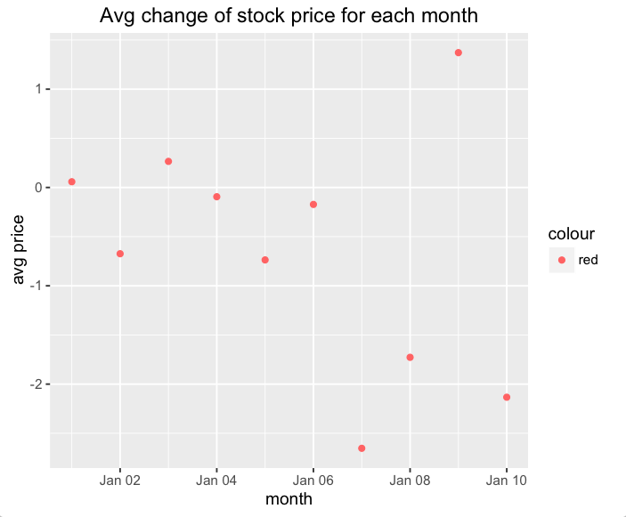
qplot(time, avg,
      data = gather(stocks, stock, price, -time) %>%
             group_by(time) %>%
             summarise(avg = mean(price)),
      colour = 'red',
      main = "Avg change of stock price for each month",
      xlab = "month",
      ylab = "avg price")
Regression models help uncover hidden trends. Libraries like dplyr and tidyr don’t just clean your data—they boost your data intuition and enable better decisions.
In the next article, we'll explore more data-visualization libraries.


